
Ola Electric
Redesigning the product page for an immersive and seamless customization experience
Background
For my 23rd birthday, I was finally ready to buy a scooter—a sleek, high-performance ride I had long envisioned. Excited, I visited Ola Electric’s website, expecting an immersive experience to simplify my decision.
Instead, the site felt transactional, with a confusing flow, limited engagement, and an underwhelming customization process. Unlike a showroom, where direct interaction builds trust and excitement, the online journey lacked the personalization and emotional connection I expected for such a significant purchase.
Challenges
The challenge was to transform the product page and customization screen into an immersive, engaging experience. The existing design felt static and transactional, lacking interactivity and emotional connection—key factors in a major purchase. Many customers prefer showrooms for their personalized, tactile experience, so the goal was to bridge this gap online, making the digital journey feel just as engaging and significant.
What I Accomplished
- Redesigned the product page and customization screen to make the journey more intuitive, engaging, and emotionally compelling.
- Introduced new typography, colors, and design elements to suggest a more immersive, premium direction for the website.
- Focused on enhancing the digital experience to make the product feel more aspirational and aligned with user expectations.
Web Interface
Research & UX/UI
Jul-Aug 2024
01 Research 01 Research 01 Research 01 Research 01 Research 01 Research 01 Research 01 Research 01 Research 01 Research 01 Research
Defining Research Goals
Motorcycle Purchase: Offline vs. Online


Competitive Analysis


Interview Goals
Goal 01
Discover who the scooter buyer is
Goal 02
Understand how they shop scooters
Goal 03
Do they care about styling options
Goal 04
Explore desire for immersive tools
Goal 05
What builds emotional product connection
From their own mouth
- Participant 1
- The ‘Buy Now’ button makes me think I’m ready to buy, but it just takes me to customization.
- Participant 2
- I want to be sure about my choices before buying, but the site doesn’t help me visualize them.
- Participant 3
- The site doesn’t feel premium enough for such a big purchase.
- Participant 4
- I want to see my customizations update in real time.
Analysing current screen

Screen 1: Navigation between product and customization is unclear, potentially confusing users
Screen 2: Customization lacks clarity and engagement, making selections hard to visualize.

Key Takeaways
“Buy Now” was confusing
Use clearer labels for customization.
Expected live updates
Live customization feedback.
Wanted more angles
Add interactive 3D scooter views.
Site didn’t feel premium
Upgrade visuals for a luxe feel.
02 Define 02 Define 02 Define 02 Define 02 Define 02 Define 02 Define 02 Define 02 Define 02 Define 02 Define
Meet Raghav

How can we improve Raghav’s journey?

Features Needed to Improve Raghav’s Journey

03 Design 03 Design 03 Design 03 Design 03 Design 03 Design 03 Design 03 Design 03 Design 03 Design 03 Design

04 UI Branding 04 UI Branding 04 UI Branding 04 UI Branding 04 UI Branding 04 UI Branding 04 UI Branding 04 UI Branding 04 UI Branding 04 UI Branding 04 UI Branding


05 Testing 05 Testing 05 Testing 05 Testing 05 Testing 05 Testing 05 Testing 05 Testing 05 Testing 05 Testing 05 Testing
I tested a Figma prototype with five participants to evaluate navigation, customization flow, and potential friction points in the experience.
Goal 1: Test how users interact with the search bar and filters.
Goal 2: Observe how users browse and navigate program listings.
Goal 3: Identify usability issues or areas of confusion.
Goal 4: Uncover any additional user needs to improve the experience.
Scenario & Results
Imagine you’re exploring NYIT’s degree programs, with specific preferences regarding location, delivery method, and area of interest. Use the search feature to find a program matching your criteria.
Navigation
-
4/5 found it smooth; 1/5 was unsure if “Customize” led to purchase.
-
4/5 found it engaging; 1/5 wanted more step-by-step guidance.
Customization
Checkout
-
3/5 said the “Continue” button was hard to notice.
-
4/5 appreciated real-time visuals and the 360° view.
Immersive Elements
Unexpected Insight
- 3/5 participants said it would be helpful to see the total price update during customization instead of only at checkout.
Key Takeaways
Clarification needed on customization path
Users were unsure if clicking “Customize” would lead to the purchase or just customization.
Visibility of the “Continue” button
Users found the “Continue” button hard to spot and needed more visual prominence.
Resulting Revisions
Renamed CTA: Changed “Customize” to “Customize & Buy” for clearer intent.

Before
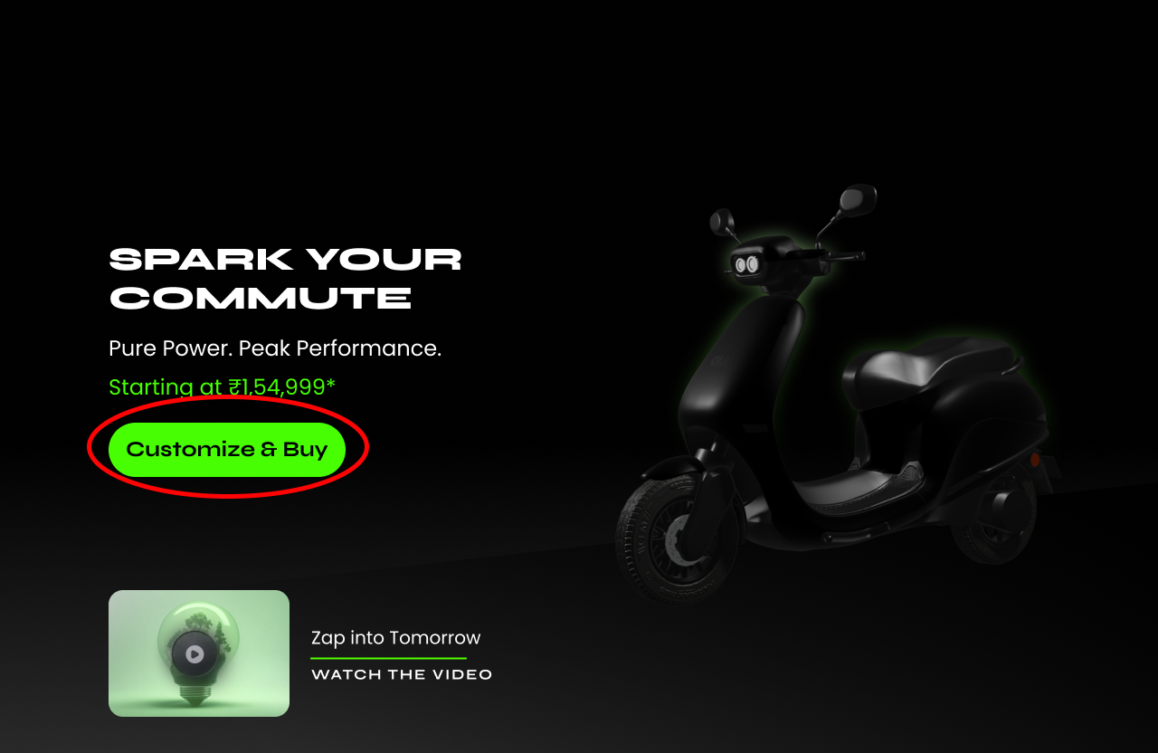
After
Highlighted Continue Button: Used a brighter color to increase visibility.

Before

After
Live Price Display: Added a dynamic price element beside the “Continue” button to reflect real-time changes as users customize their scooter.

Before

After
06 Final UI 06 Final UI 06 Final UI 06 Final UI 06 Final UI 06 Final UI 06 Final UI 06 Final UI 06 Final UI 06 Final UI 06 Final UI
Next Step
Moving forward, one key area of improvement is reducing the number of clicks in the user journey. Instead of having users navigate through the product page, followed by a separate customization and buy page, we could explore an integrated experience. This would allow users to customize their scooter directly on the product page with a single click, offering a smoother and more efficient flow from customization to purchase.
Additionally, continuous efforts will be made to enhance the online shopping experience, bringing it closer to the personalized interaction users have in a showroom. We can explore features where users are guided through the customization process, similar to how a salesperson would ask questions and suggest options in-store. This would foster more trust in the online process and help make the purchase feel as personalized as possible.