
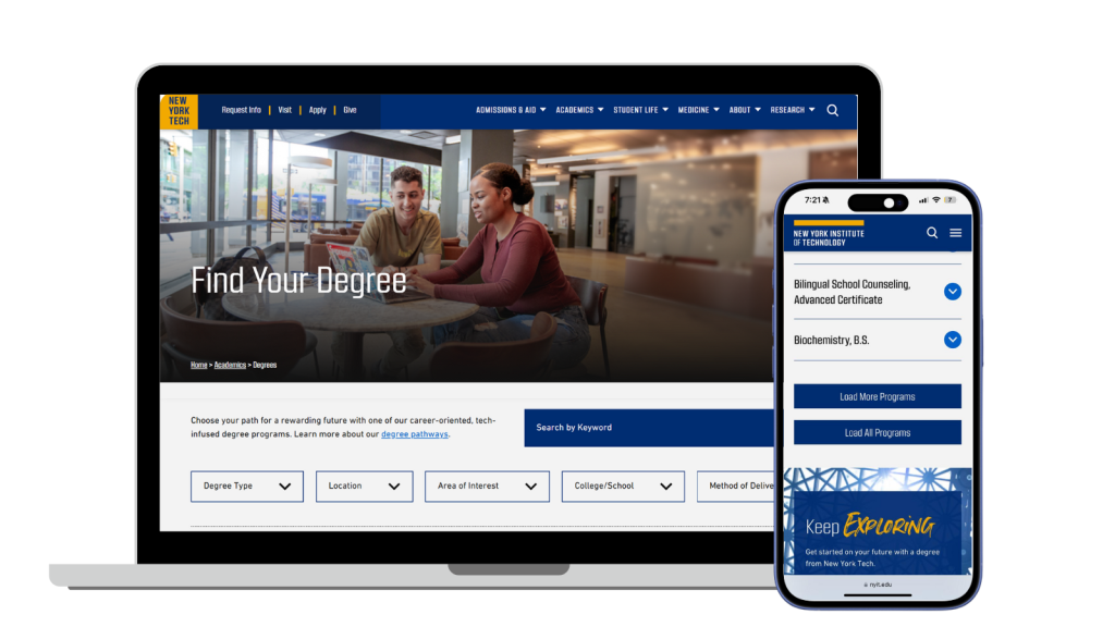
NYIT
Enhancing the degree search experience for better program discovery.
Background
NYIT was undergoing a full website redesign, updating its overall structure and visual identity. As part of this larger transformation, I focused solely on the Degree Search experience, ensuring that students could efficiently explore programs. The previous interface presented challenges in usability and discoverability, making it harder for prospective students to find the right degree programs. Elements such as filters, search functionality, program listings, and navigation all had room for improvement to create a smoother and more intuitive search process.
Challenges
The search experience had friction points, including limited filtering options, a lack of prominent search functionality, and an inconsistent program listing layout. Users often had to scroll excessively, making it difficult to find relevant programs quickly. The challenge was to refine these elements while ensuring alignment with the broader website redesign.
What I Accomplished
- Identified key frustrations in the degree search experience.
- Streamlined the process to reduce effort and cognitive load.
- Designed an improved search and navigation flow for easier program discovery.
- Structured the program listings to enhance clarity and usability.
Responsive Website
Research, UX/UI Design
March – May 2024
01 Research 01 Research 01 Research 01 Research 01 Research 01 Research 01 Research 01 Research 01 Research 01 Research 01 Research
Balancing User and Business Needs
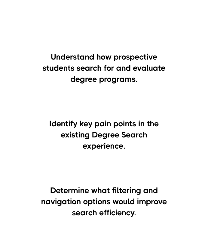
Improving the Degree Search experience required addressing both user frustrations and NYIT’s institutional goals. I set clear research objectives to enhance usability while ensuring alignment with the university’s broader digital strategy.

Secondary Research

Competitive Analysis


Understanding Users
Interview Goal 01
Who is searching for programs, and what are their needs?
Interview Goal 02
How do they typically search—filters, browsing, or direct search?
Interview Goal 03
What challenges do they face when finding programs?
Interview Goal 04
Do they find filters useful, or do they rely more on search?
Interview Goal 05
What factors make program selection easier or more difficult?
In their own words
-
Mark
22, College Student, Urban
- I just want to find the right program quickly—scrolling through a long list is frustrating.
-
Lisa
28, Career Changer, Suburban
- It’s not clear which programs are online or in-person. I have to click on each one to find out.
-
David
35, Working Professional, Rural
- There are so many programs at once—it’s overwhelming to go through them all.
Analysing current screen

No Search Bar – Users must rely solely on filters to find programs.
Filtering Experience – Could be more intuitive and efficient.


Cluttered Listings – Inconsistent design makes scanning and comparison difficult
Key Takeaways
Too Many Options
Display programs in a clear, structured layout.
Delivery Not Clear
Show online or in-person info upfront, at glance.
Hard to Navigate
Add smart filters to help users find faster.
02 Define 02 Define 02 Define 02 Define 02 Define 02 Define 02 Define 02 Define 02 Define 02 Define 02 Define
Meet Mark

How can we improve Mark’s journey?

So what features are needed?

03 Design 03 Design 03 Design 03 Design 03 Design 03 Design 03 Design 03 Design 03 Design 03 Design 03 Design
04 UI Branding 04 UI Branding 04 UI Branding 04 UI Branding 04 UI Branding 04 UI Branding 04 UI Branding 04 UI Branding 04 UI Branding 04 UI Branding 04 UI Branding
As part of a larger website redesign, the Degree Search feature was aligned with the overall UI and branding changes being implemented across the site. We followed the updated design guidelines, ensuring consistency in colors, typography, and visual elements, so the Degree Search experience felt integrated within the new website structure. By adhering to these established design principles, we ensured the feature blended seamlessly with the broader redesign.

05 Testing 05 Testing 05 Testing 05 Testing 05 Testing 05 Testing 05 Testing 05 Testing 05 Testing 05 Testing 05 Testing
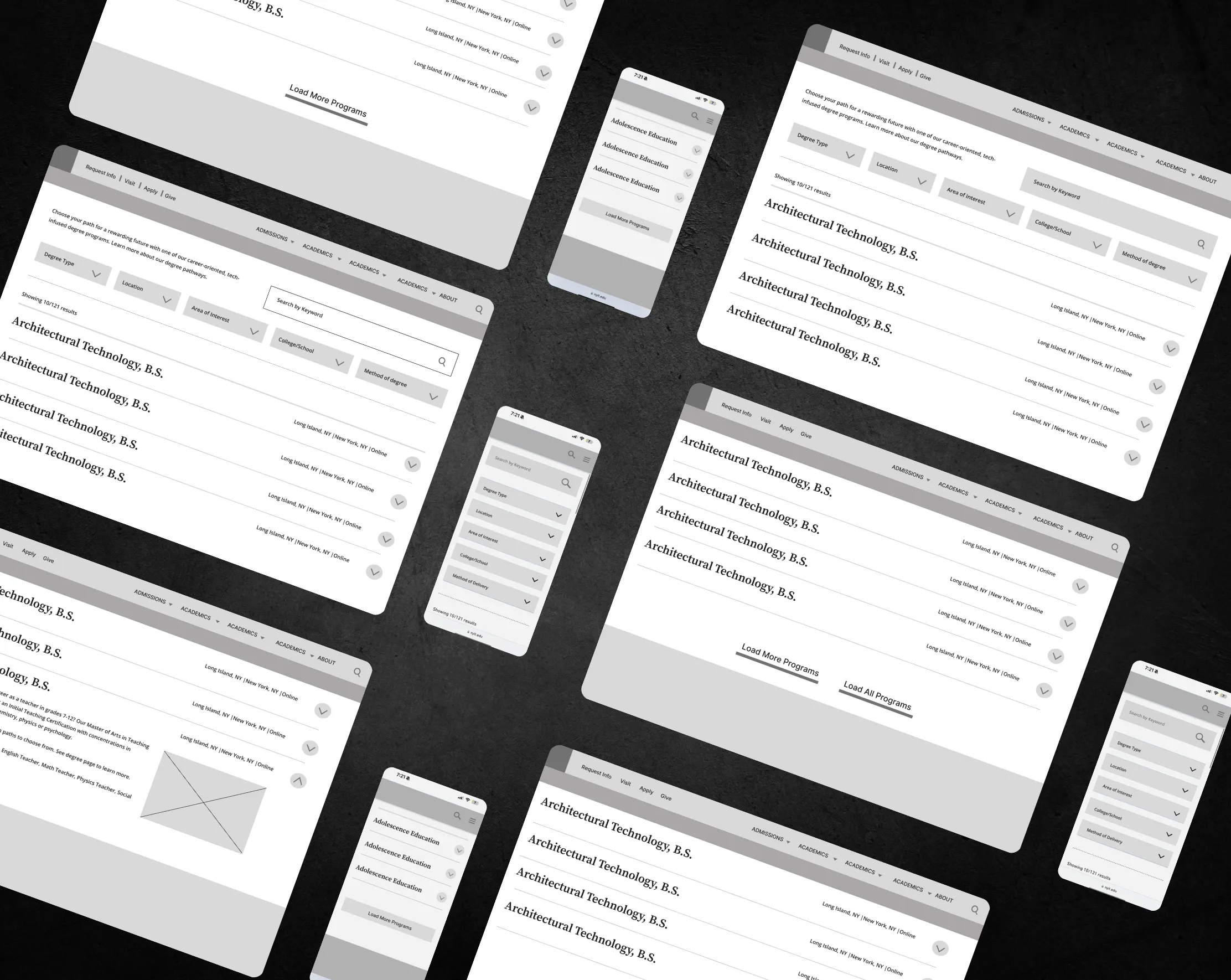
To ensure the redesigned Degree Search experience met user expectations, I conducted usability testing with 5 participants using a Figma prototype. The goal was to assess how well users could navigate the search experience, interact with filters, and find degree programs efficiently.
Goal 1: Test how users interact with the search bar and filters.
Goal 2: Observe how users browse and navigate the program listings.
Goal 3: Identify any usability issues or areas of confusion in the search
Goal 4: Uncover any additional user needs or improvements that could enhance the experience.
Scenario & Results
Imagine you’re interested in exploring degree programs at NYIT. You have specific preferences regarding location, delivery method, and area of interest. Try using the search feature to find a program that matches your criteria.
Search Bar & Filters
-
• 5/5 users successfully used the filters.
• 4/5 found the Method of Delivery filter intuitive.
• 1/5 initially overlooked the filter section but found it after scanning the page.
-
• 5/5 users navigated the program listing easily.
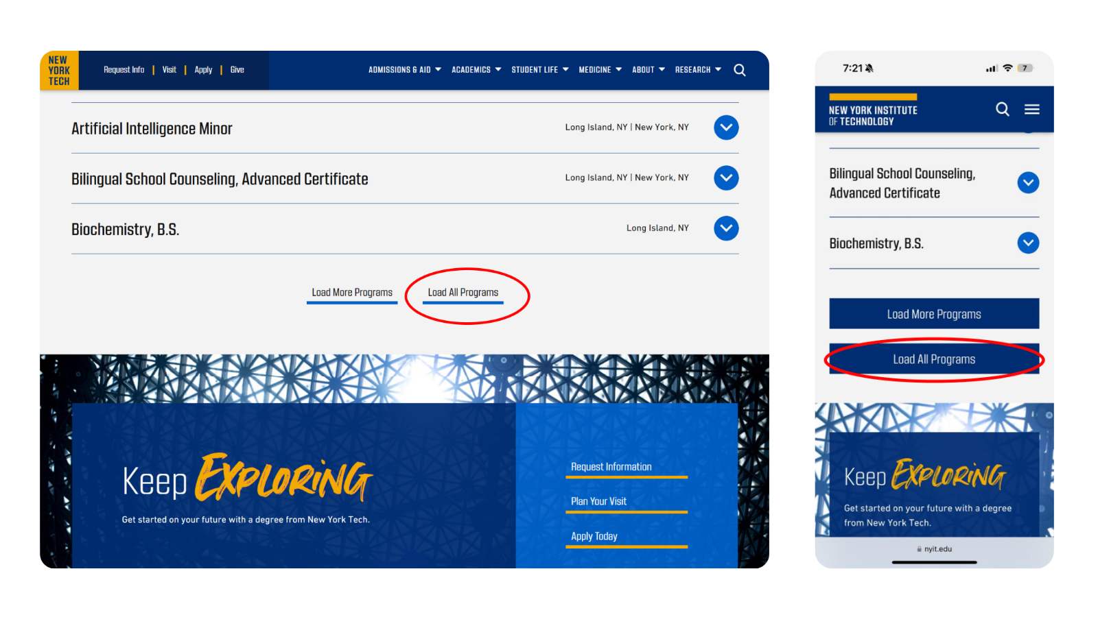
• 3/5 users preferred scanning a longer list instead of clicking “Load More”
Load All Programs Button
Guidance for Users
- • 4/5 users felt the search bar blended into the page too much and suggested making it stand out more.
-
• 2/5 users felt unsure where to start and wanted guidance before using the filters.
Clearer Labeling
Key Takeaways
Search Bar Visibility
Users felt the search bar should be more prominent.
Load All Programs Button
Added "Load More" button to see programs once
Guidance for
Users
Users needed help deciding where to start before using filters.
Clearer Labeling
Users felt the search button wasn’t clear, especially regarding live keyword filtering.
Resulting Revisions
Search Bar & Filters: Renamed the lower “Search” button to “Search by Keyword” to clarify its purpose and highlight real-time results.
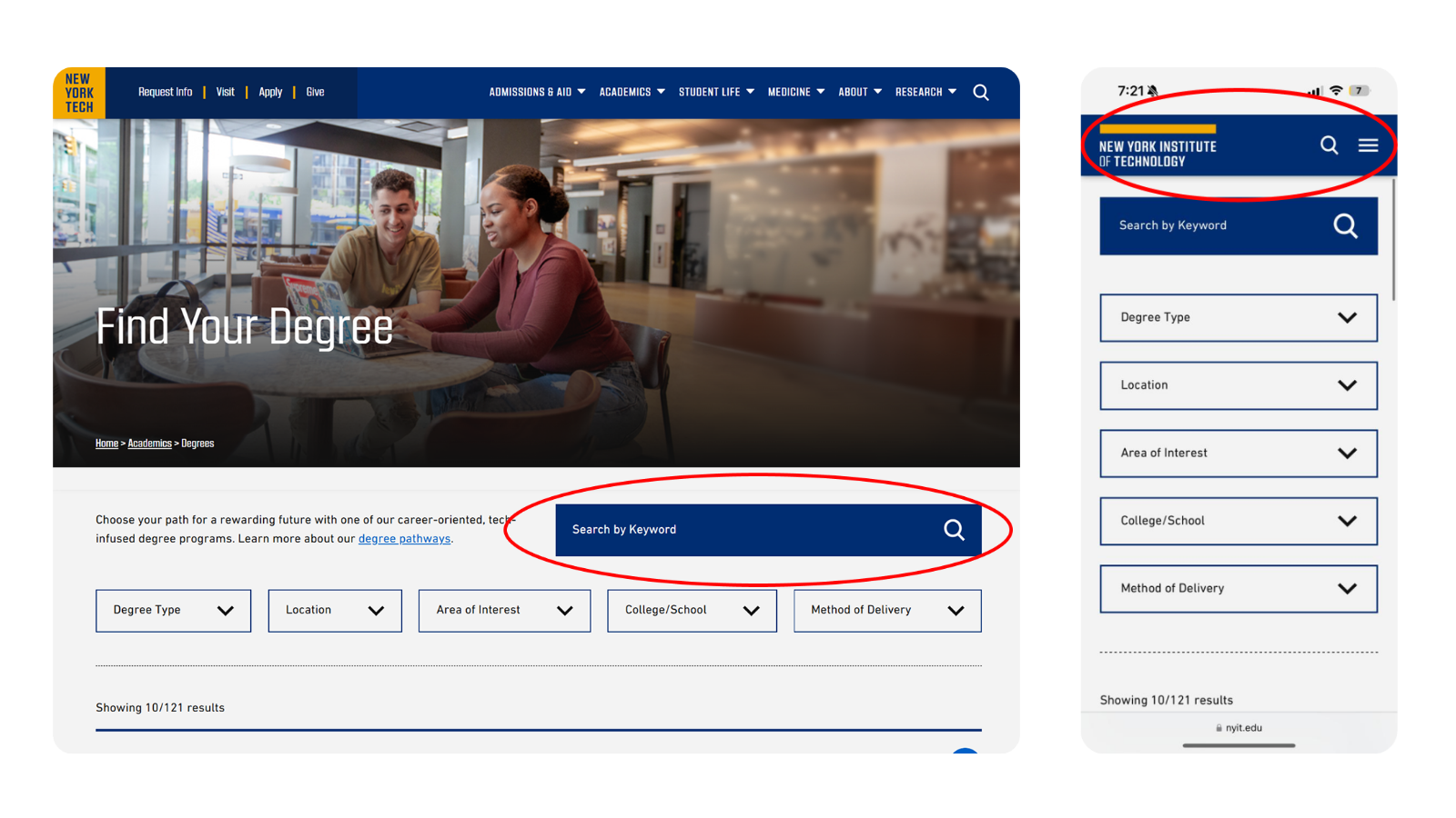
Additional User Needs: Added a “Learn more about our degree pathways” link for users needing direction before exploring programs.

Browsing & Navigation: Added a “Load All Programs” button to allow users to view all programs at once, eliminating the need to click “Load More.”
06 Final UI 06 Final UI 06 Final UI 06 Final UI 06 Final UI 06 Final UI 06 Final UI 06 Final UI 06 Final UI 06 Final UI 06 Final UI


Measuring Success
↓
Search Efficiency
Real-time search suggestions reduced the time to find programs by 23%.
↓
Filter Effectiveness
The new ‘Method of Delivery’ filter increased filter engagement by 39%.
↓
Browsing Satisfaction
‘Load More’ and ‘View All Programs’ options makes 61% improvement.
Next Step
As testing continues, several opportunities have emerged to further enhance the Degree Search feature. One key improvement is integrating personalized recommendations based on user behavior and preferences, helping users discover programs tailored to their interests. Expanding filter options to include criteria like accreditation status, student-to-faculty ratio, and program reputation could refine search results even further. Additionally, enhancing program comparison by allowing users to view multiple programs side by side would support more informed decision-making. Implementing real-time chat support or a chatbot could provide instant assistance, guiding users through the search process. Lastly, introducing dynamic content such as program videos or virtual campus tours could create a more engaging and immersive experience. These improvements will continue to refine the search process, making it more personalized, intuitive, and user-centric.